Exploring the Beauty of a Neutral Color Palette
Tags
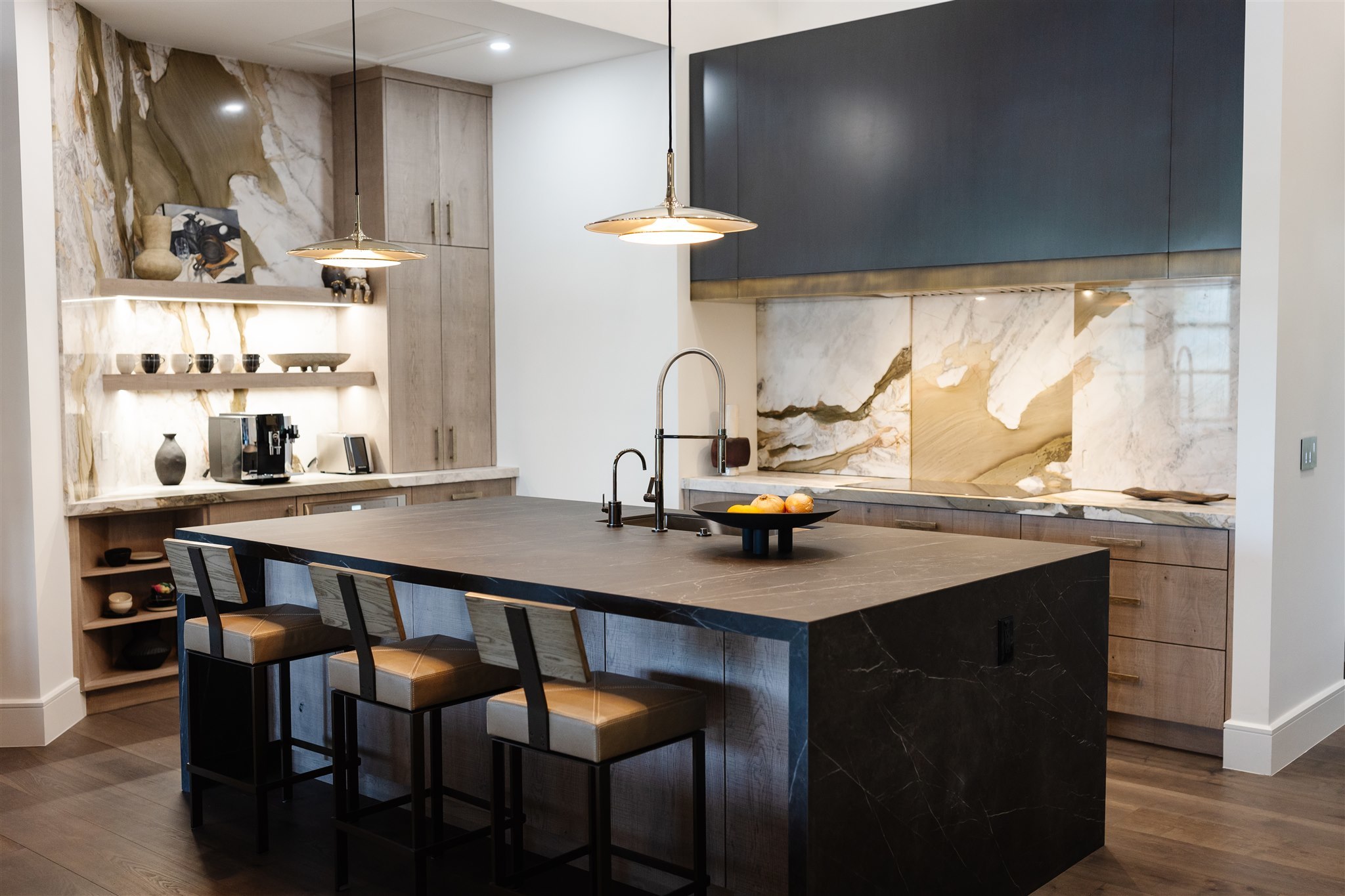
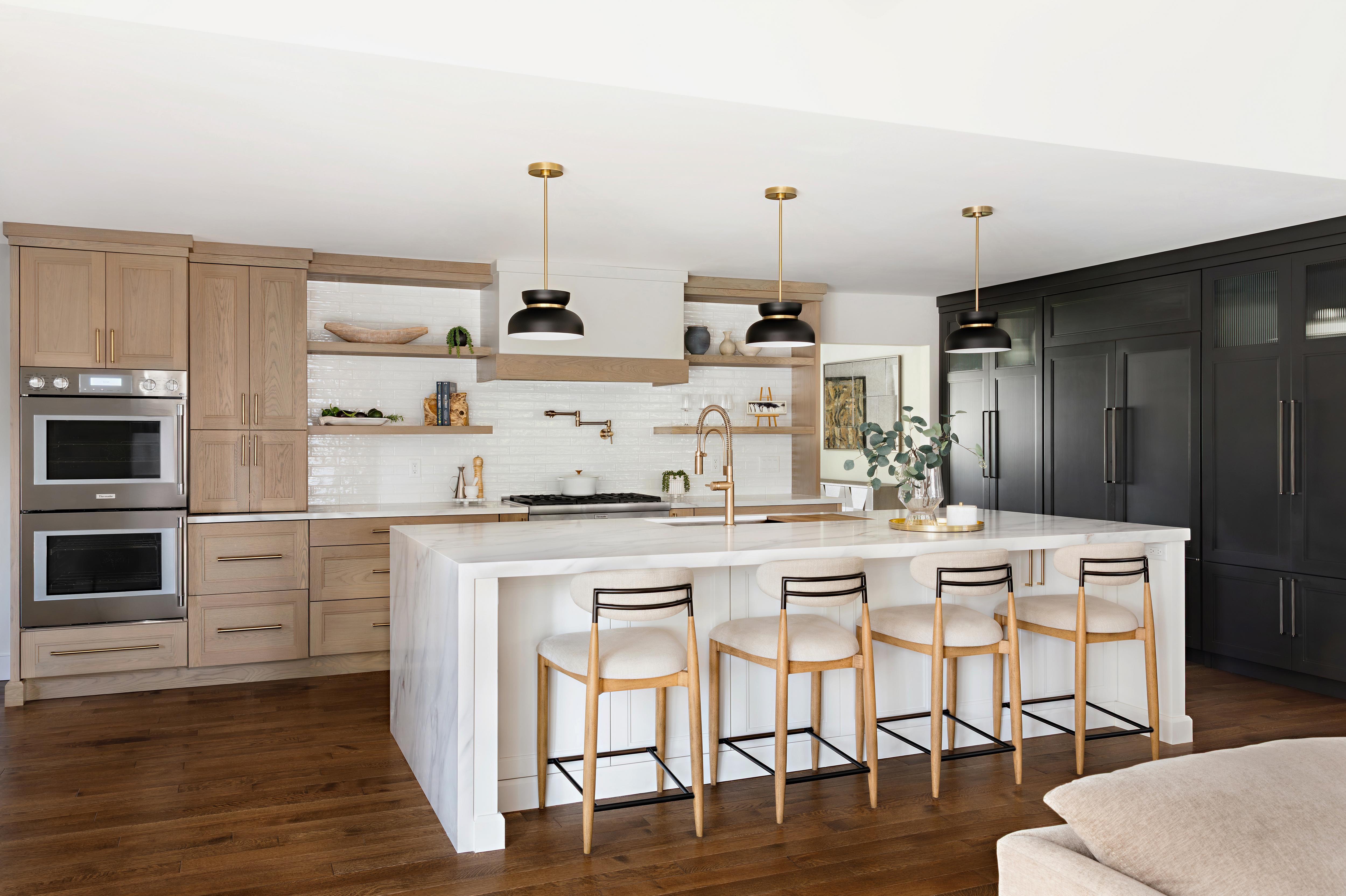
In the second installment of our five-part series exploring color, we turn to the possibilities that emerge through a neutral palette. Within the interior design context, neutrals are often represented by shades of white, beige, brown, and black. However, today’s articulation allows the palette to extend far beyond traditional sensibilities and embrace a vast spectrum of color variations and finishes. Matte Black, Iron Gray, and Snow White create a sense of modernity and lean slightly industrial while shades like Alpine White, Creamy Beige, and American Oak offer a more transitional expression. Yet whether the palette is drawn from warm or cool undertones, matte or natural finishes, the aesthetic remains polished, luxurious, and serene.
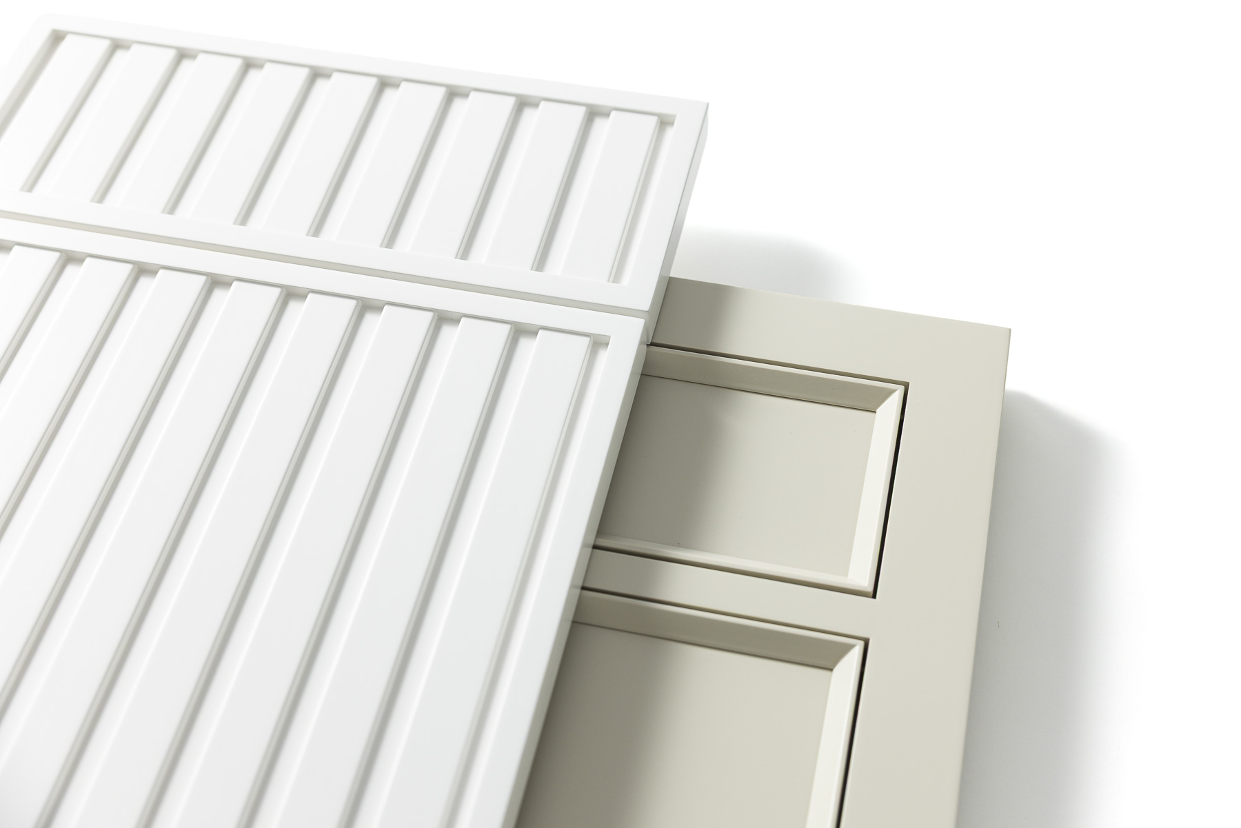
At its core, the neutral palette offers a sophisticated and design-forward approach to simplicity. But the design is far from sparse. Through variation in tone, saturation, texture, and material choice, the palette elegantly evolves throughout the home as each shade responds to changes in natural light and presents a dynamic interplay across each surface. In this way, craftsmanship, materiality, and detail become the focal point.
If you feel drawn to the sophistication and rich nuance of a neutral color palette, consider these interior design approaches to create a space that feels intentional, refined, and timeless.
Build Depth with Tonal Variation
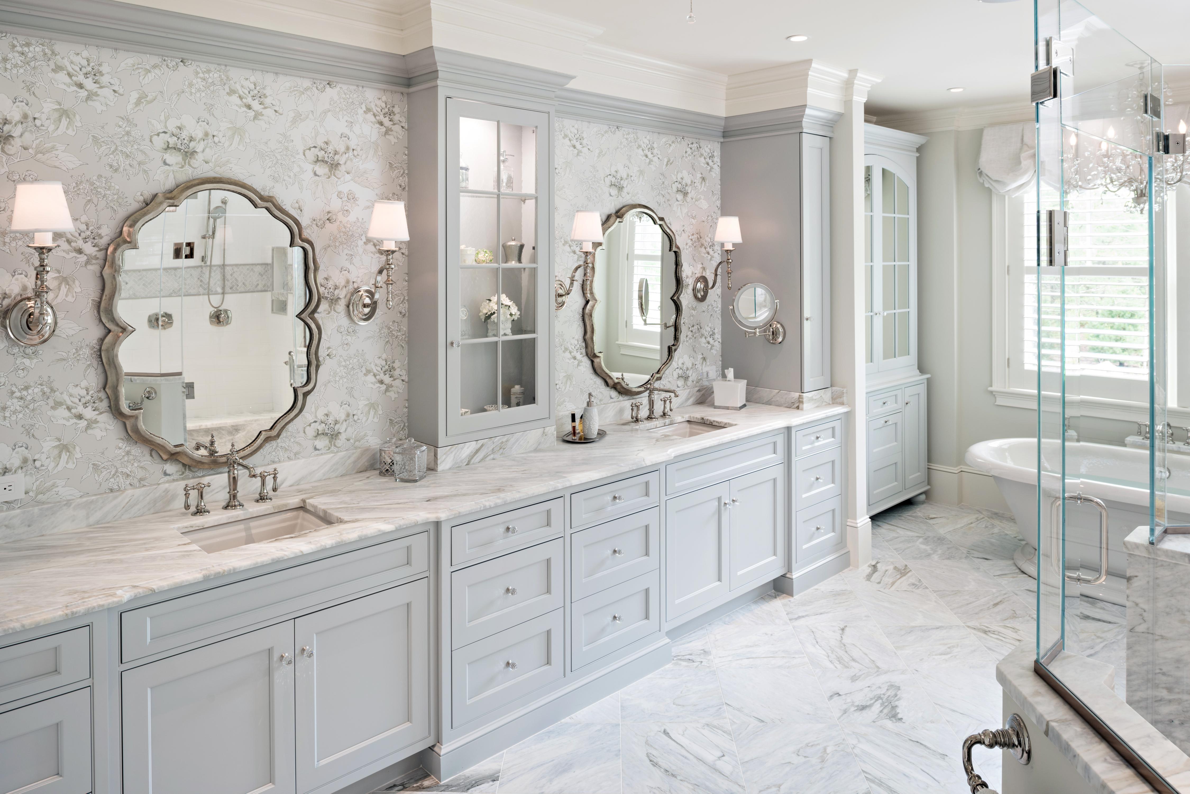
Tonal variation allows the seemingly restrained neutral palette to be presented as a richly layered and dynamic array of color. Even the slightest shift in undertone can create a unique experience within the neutral palette allowing color to unfold in a distinctive yet refined spectrum. Colors with earthy influences and woodgrain draw warmth into the palette while more muted hues and metal accents establish a cool foundation.
Emphasize Materials
A carefully edited color palette allows fine craftsmanship and materiality to take center stage. When color is restrained, the character of each material selection becomes more pronounced. The natural veining within a marble countertop becomes more distinctive. The unique cut of each selection of woodgrain becomes more expressive. And textiles transform into visual comfort. Each element provides a depth and character that feels intentional, natural, and luxurious.
Play with Pattern
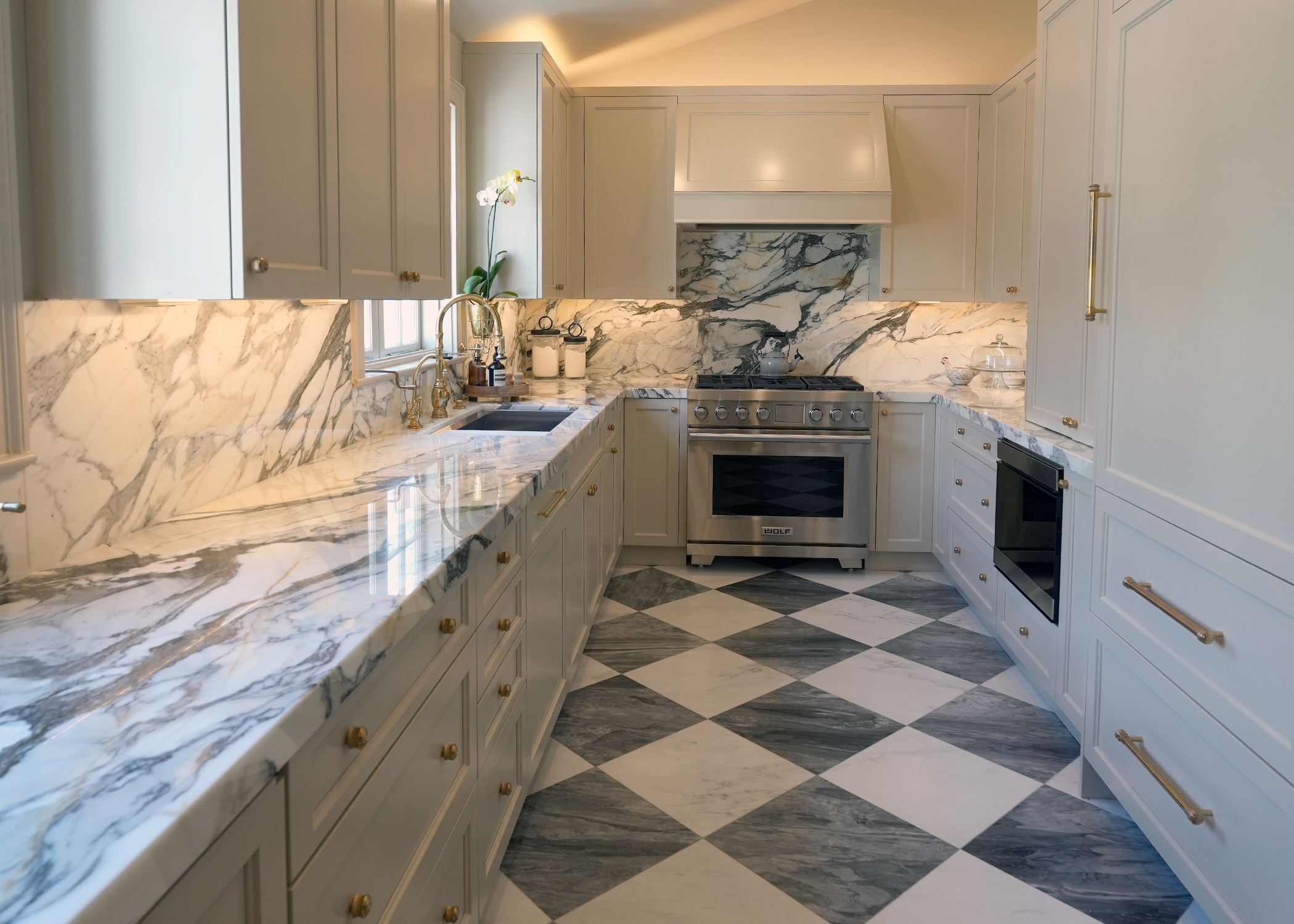
The tonal design of a neutral palette provides the freedom to experiment with patterns while maintaining a sense of harmony. Patterns become a source of rich visual detail rather than competing for hierarchy within a bolder display of color. When applied within a neutral color scheme, plain-sawn woodgrain, expressive marble, and bold tiles create movement and detail without disrupting the continuity of the design. Patterns as subtle as organic forms or as bold as geometric prints can equally be incorporated when the neutral palette is maintained.
Add Interest with Layered Texture
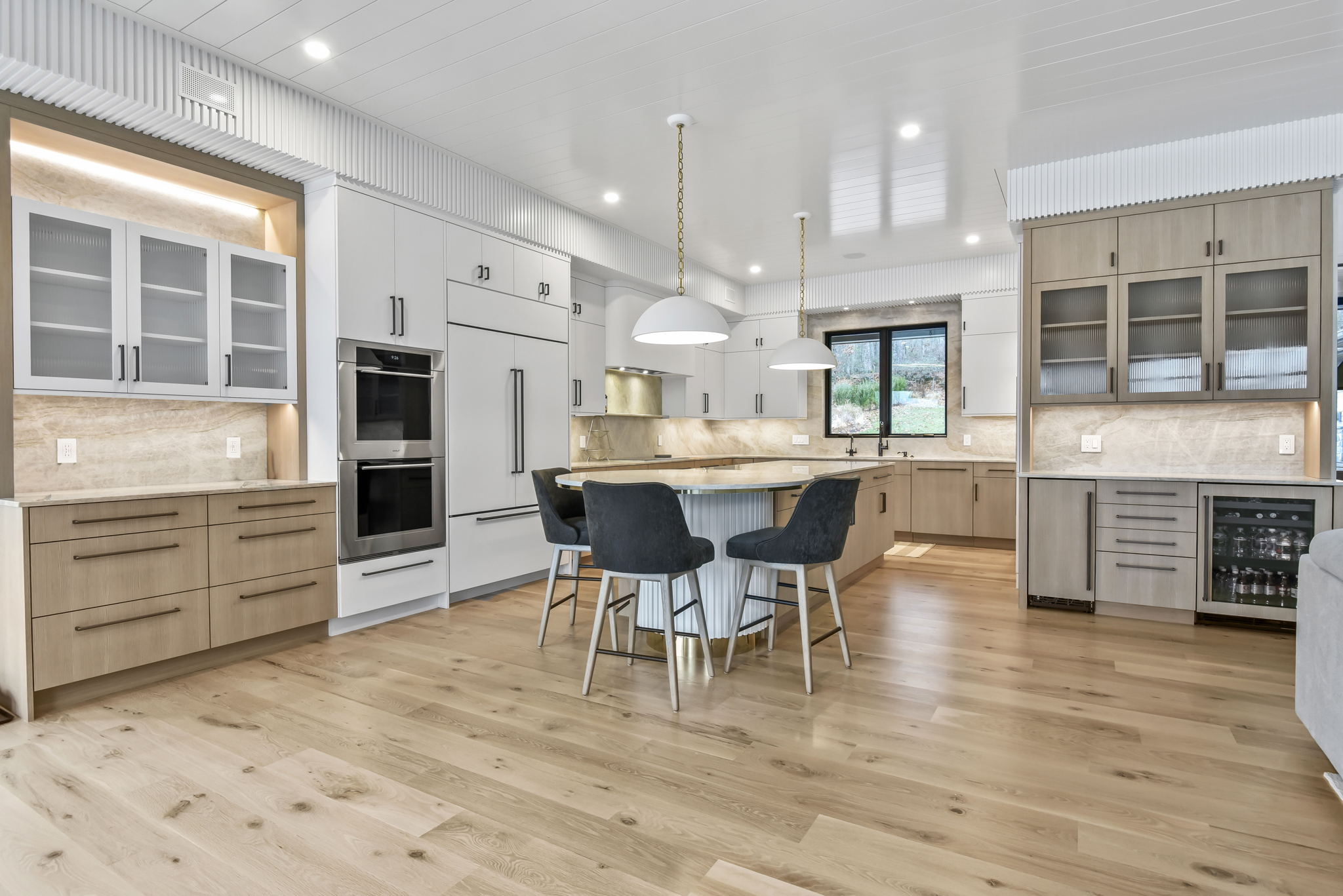
Texture provides remarkable dimension within a neutral color palette. Layering surfaces create distinction while remaining refined. Smooth tile, organic stone, fluted details, textured laminates, and sumptuous upholsteries create impactful moments of intrigue against the open foundation that neutral colors provide.
Developing Your Unique Life of Beauty
Neutral colors provide a quiet sophistication that is elegant and enduring. In many ways the neutral palette becomes less about color itself and more about what possibilities emerge when designing around a carefully edited composition. Details become richer, nuance more pronounced, and fine craftsmanship is brought into focus. The result is a space that feels luxurious and elegant while remaining approachable and comforting.
Whether you are just beginning a new design project, or you are reimagining a cherished space, our community of professional interior designers are here to guide you throughout your journey. Explore more interior design inspiration or visit a showroom to share your vision.